Showing posts with label graphic design. Show all posts

Monday, 8 October 2012

illustration inspiration!

Today I have fallen in love with the illustrations of Dimitra Tzanos. His playful style and awesome use of colour just demands your attention and you simply can't help but fall in love with the designs. Wish I owned them all and could hang them up throughout my house ha ha ha!


On his website he has the following to say:
"Born and raised in Johannesburg, I'm of Greek origin and currently live in Athens. I studied Graphic Design in Athens and got my Masters in London but now prefer to call myself an illustrator or even just a drawer...whatever the world understands. But generally I have this obsession with organising and categorising information, eliminating unnecessary details and keeping things simple. Mostly you can see this in my doodles and drawings!"

Below is a series he did based on "5 events that shaped South Africa's wine industry. They too are AWESOME and you have to agree that this is one seriously talented man!


Source: http://creativeroots.org/2011/04/5-events-that-shaped-the-south-african-wine-industry/


Check out more of his work here >> http://www.dimitratzanos.com/

Friday, 5 October 2012

NEW WEBSITE!!

I have finally managed to get my stuff together and design a website where I can upload samples of my work and create a general space to keep all of my inspiration on one page. Please pay it a visit to see what I've been up too! http://ladesigns.typepad.com/ladesigns/


Thursday, 2 August 2012

Rams' 10 principles of good design

Dieter Rams (born 20 May 1932)  is a German industrial designer who asks the important question... "Is my design good design"? Rams was concerned by the state of the world around him and realised that as a designer, he was contributing to the "confusion of forms, colours and noises".

http://www.lifeofanarchitect.com/who-is-dieter-rams/

"As good design cannot be measured in a finite way he set about expressing the 10 most important principles for what he considered was good design" (Vitsoe, 2010).

RAMS' 10 PRINCIPLES OF GOOD DESIGN
Good design...

...is innovative
Innovation can never be exhausted due to technological advancements!

...makes a product useful
We do not purchase products that we do not need, so a product needs to serve a purpose and fulfil a need for the consumer purchase to occur.

...is aesthetic
Beauty is a by-product of usefulness as its aesthetic quality can have a lasting effect on people.

...makes a product understandable
If something is misunderstood, then it cannot be appreciated.

...is unobtrusive
A product and its design should allow for self-expression by the end-user, they should be able to make it part of them not forced to try and fit in with the product.

...is honest
Honest design does not falsify a product by making promises that the end product cannot keep. With today's technological world, a brand that is dishonest will be instantly exposed and the repercussions are lethal!

...is long-lasting
Many designs are trendy and are therefore dated. Good design shies away from such trends. Designers should write their own trends as apposed to being just another follower!

...is thorough down to the last detail
Nothing should be left to chance as one should admire the aspect of intelligent consumers. People are not stupid and are therefore quick to pick up on even the smallest mistakes!

...is environmentally friendly
Good design should adhere to conservation at all times. What we leave behind is almost more important than what we take!

...is as little designed as possible
We all know the infamous phrase "less is more", but Rams suggests "less, but better" should function within good design. He believes that we should consider simplicity and essential purity!

In conclusion I'll leave you with a quote to think about...
“As designers we have a great responsibility. I believe designers should eliminate the unnecessary. That means eliminating everything that is modish because this kind of thing is only short-lived.” Dieter Rams – interview with Icon Magazine

Friday, 20 July 2012

Inspiring business card designs

I love receiving a business card that make you stop and say "WOW, this is brilliant" and I'll hang onto the card regardless if I'm interested in what it's about or not. Below are some inspiring examples of designers who thought outside of the norms and conceptualized some truly clever, quirky cards!
http://www.boredpanda.com/creative-business-cards-part3/


Yuka Suzuki, hair and make-up artist


Got to love these... what next!


I'm sure everyone has at some point been blinded by the sight of the infamous crack of doom! Well, an ad agency in Berlin - Scholz & Friends - has turned the gaggable into he desirable if you know what I mean. If this doesn't put a smile on your Friday-Face then you're in need of a coffee break.


http://www.boredpanda.com/butt-crack-cleavage-t-shirt/

Thursday, 19 July 2012

Too clever not to share!

Quote for the day...

"As consumers of visual art we have become highly sophisticated readers of signs and signals. We decode meaning from images with subconscious ease." - David Crow
http://logosdesignsideas.blog.com/2011/07/13/clever-logos-with-hidden-symbolism/

http://www.boredpanda.com/clever-logos-with-hidden-symbolism/

Monday, 16 April 2012

Info Graphics


I have been tasked with visually putting together some statistics (and at first I thought to myself - UUURRRRGGGGG, I really don't feel like doing this, but as with any project I started by doing some research and thought to myself: "look Lecia, if you're gonna do this just try to make it fun for yourself and make the project interesting even if it's just a really small project"

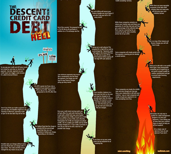
I therefore started doing a bit of digging into Info Graphics and was amazed at how much fun this could actually be! I have dealt with it way back when but I guess as with anything, a person forgets! Below are a few cool samples of what I've found on line (thanks to http://www.hongkiat.com) and I think it's given me some "oemf" to get going on mine!


One thing that has hit home again is that Info Graphics can take the boring statistic and make it interesting to the viewer allowing them to experience the information provided as apposed to just blindly processing the information in front of them!


Friday, 9 March 2012

AWESOME poster - need I say more!

http://salenacastro7.wordpress.com/2011/01/31/21/
When you first see the above cigarette you miss what's really happening within the lit, burning tip... look carefully and see the burning trees and houses! If this isn't enough to make someone think twice before at least flicking their bud out the window then I REALLY don't know!

Monday, 5 March 2012

Theory of gestalt in graphic design

Today I will be introducing my students to the theory of gestalt in graphic design! It always amazes me that as a graphic designer (working in the industry) we tend to get to the point where we do things a certain way automatically and every now and then I do enjoy going back to the books to re-evaluate what it is that we are doing as professionals. Going through gestalt again reminds me of how our human brain functions and interpret the various things we see. I find it fascinating to be honest!

So gestalt then...
This is probably the most applicable psychological theory when it comes to graphic design. We as graphic designers are most certainly not psychologists and after researching extensively I have found the best explanation on 2 fellow blog (http://jayce-o.blogspot.com/2010/12/graphic-design-and-gestalt-theory.html and http://www.designdune.com/inspiration/the-best-photos-to-illustrate-gestalt-theory/). This description is just enough to understand and apply without having the HUGE theory component added to confuse my students.

Gestalt teaches us how visual perceptions (what the eye sees) can be formed. Gestalt principles that are applied in graphic design include proximity (closeness of the position), similarity (similar form), closures (closure of), continuity (continuity of the pattern), and figure ground.

1. Proximity - Objects with a position adjacent to each other will be grouped as a whole.
You perceive this logo as one unit and not of a whole bunch of smaller parts.
 

2. Similarity - Objects forms and similar elements will be grouped as a whole.
Your brain has quickly interpreted the eagle surrounded by the sun and you moved on. However, if you spend some time trying to analyse the picture, you will soon discover that the eagle contains similar elements with the sun; this is the reason why you brain has interpret this image as a whole. This picture is the perfect illustration of the similarity principle, which happens when there are elements that look similar and the brain concentrates them into a single pattern or image. In this case, the triangular shapes are the similar elements, so you can see the eagle, the sun or the image as a whole.


3. Closure - An object will be intact even if the form is not closed entirely.
Your eye will automatically sees the shape "A" in the logo as it completes the missing parts.
 

4. Continuity - The object will be perceived as a group because of the continuity of the pattern.
As a result of continuity your brain processes what it seas to be able to read this logo.


5. Figure Ground - An object can be seen as two objects with a touch of foreground and background. Each can be identified as objects without having to form it into a solid.
Sample of Figure Ground: see the face of the baby in the negative space of the moon!